project history
Pawiis is a software that is responsible for automating processes so that veterinary work is much simpler and the life of your best friend is of higher quality. In addition, they are dedicated to promoting the business of providers of related products and services: such as hairdressers or salespeople. With their own IT team, they managed, as their enterprise grew, to put together a robust and complex app that largely addressed everything they needed to accomplish, but had been designed "on the fly" and needed to be redefined based on the objectives of the project. business: drive more conversions and simplify recipe making and sharing.

Stage 1 Research
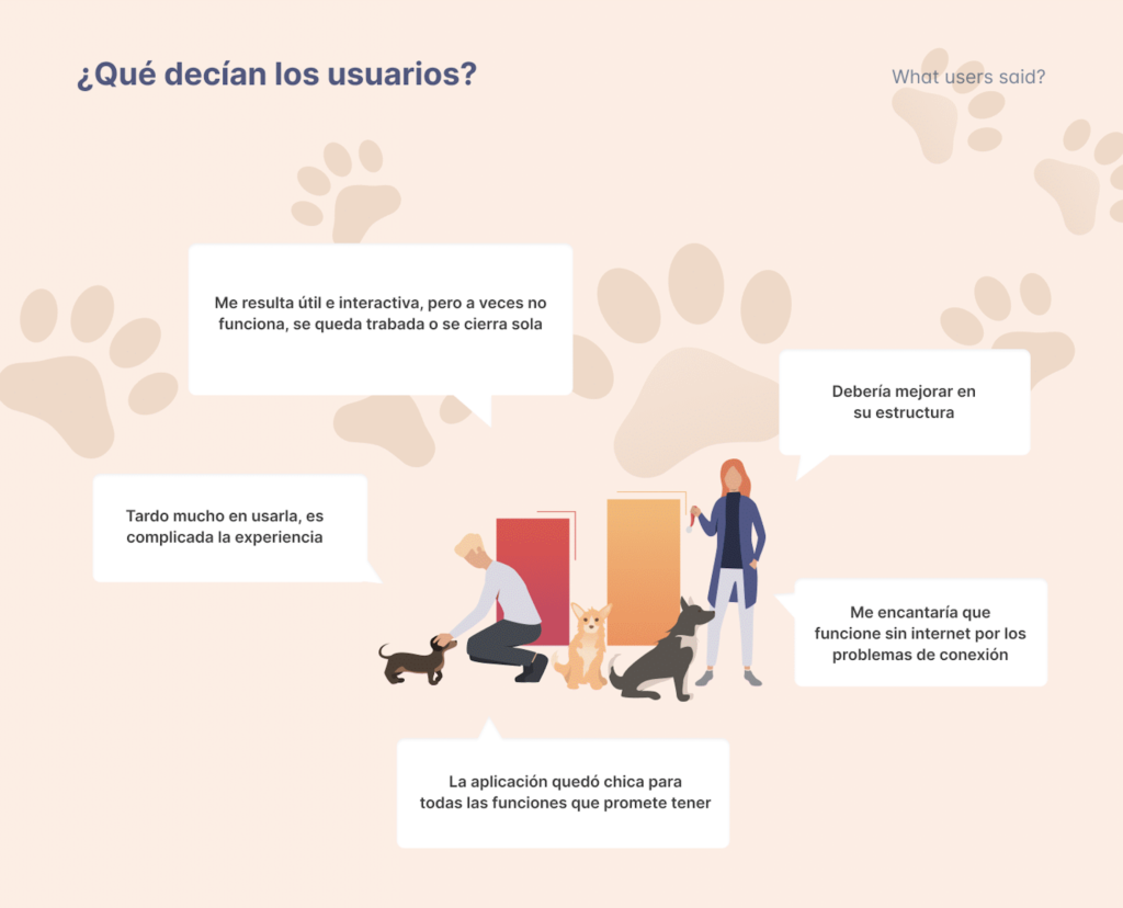
In the Research process, the design team brought together a group of Pawiis users and gave them tasks to perform, analyzing behaviors and feelings in relation to the app. Two types of «pain point» were detected, some related to the experience (UX) and others to the interface (UI). The main idea of Pawiis is to facilitate the work of those who use it and that was not being reflected by the software.

Stage 2 Redesign
flows
To propose the redesign of flows, the Pckz team designed a project that considered four fundamental pillars:
- Identify the main objectives of users and the organization
- Know fully the current flows of the Pawiis platform
- Redesign modifying or proposing from scratch according to each situation
- Ensuring the feasibility of developing this design
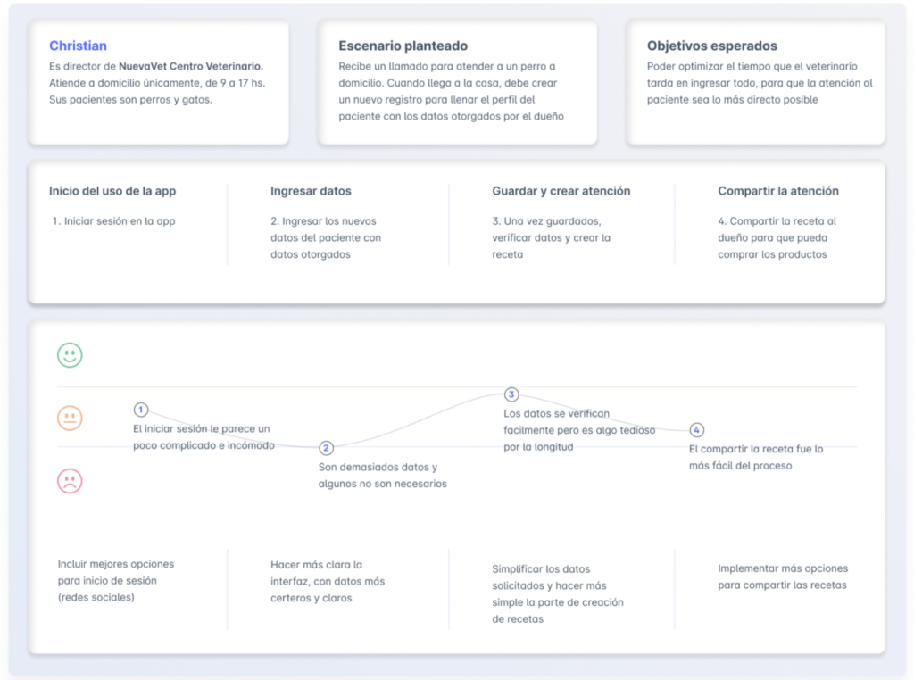
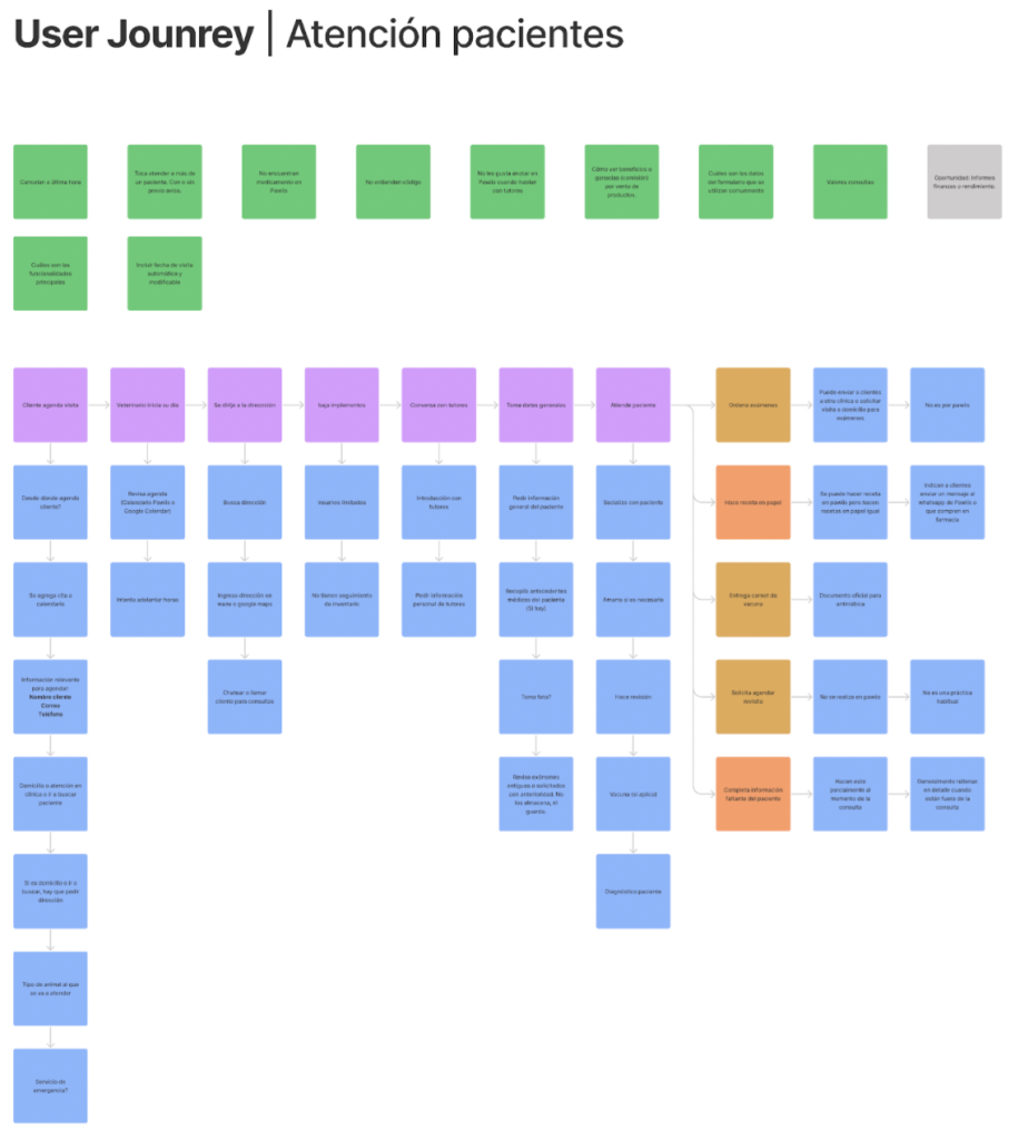
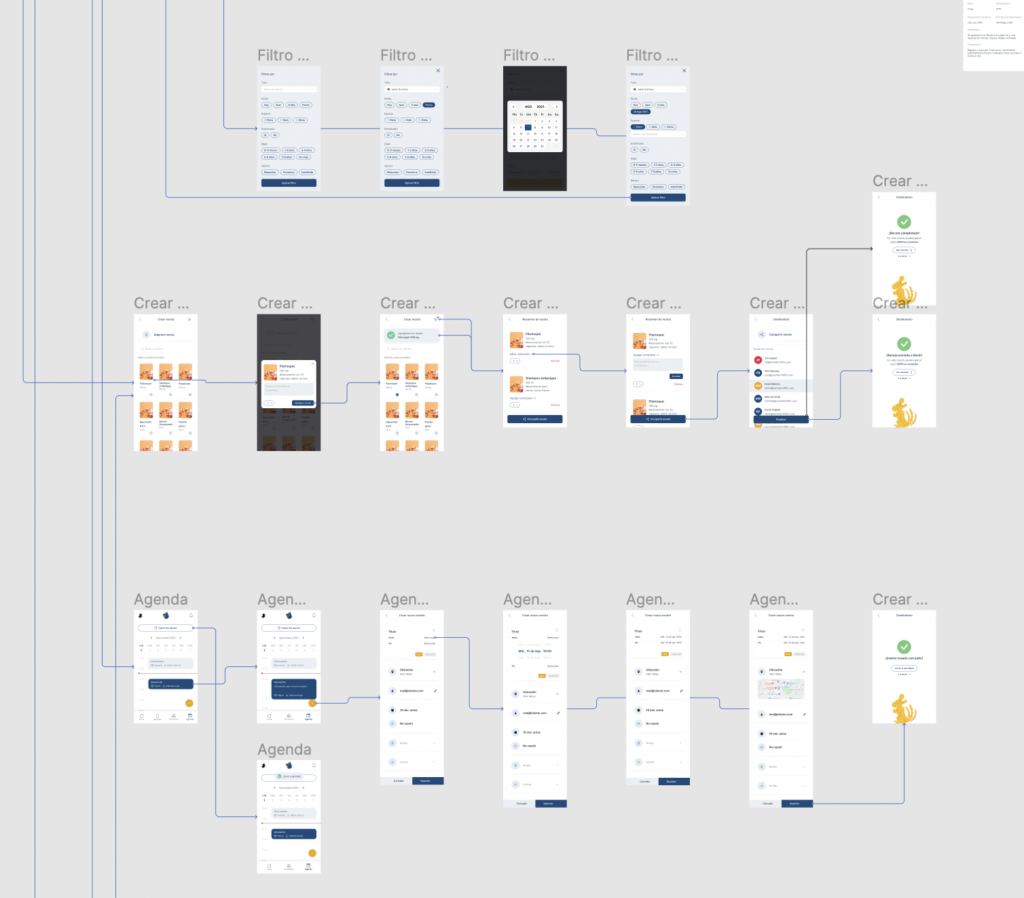
With all this material, the Flow Chart of the current Pawiis was created, which served as a tool for analysis, allowing to find noises and opportunities for improvements to reorganize the content. Then, a Journey Scheme was developed, allowing the detection and prioritization of specific functionalities and the creation of a new one: RECIPE.

wireframing

Stage 3 Development
The Pckz Development team participated in the construction of the design by attending the Preview Shows, so when they had to take control and build the complete platform, they already knew its features and content. Once the design was finished, the platform was already assembled and under development and the design team continued to be part of the project to correct errors and ensure that the design was complied with in all emerging aspects. The development was completely in VUE and was connected in collaboration with the Pawiis development team to the existing backend. They also worked together to solve the new and preserved flows and even trained the Pawiis team for the subsequent takeover.
Every stage of this project had a trial run, and Pawiis determined to test it with select users before launch, with rebranding (and even naming) a few months after delivery.